Bed Bath & Beyond -
Account Navigation
Information hierarchy and design for account navigation
Summary
The goal of the project was to update the My Account dashboard and flyout navigation.
Doing so can give users easier access to their Stored Value (SV) or any promotions that we run, as well as aiding users who still haven’t found what they’re looking for.
I worked on this project as the designer in charge of the My Account Workstream, reporting to the UX Director and Senior Director of Ecommerce.
Research
Competitiors audit (above)
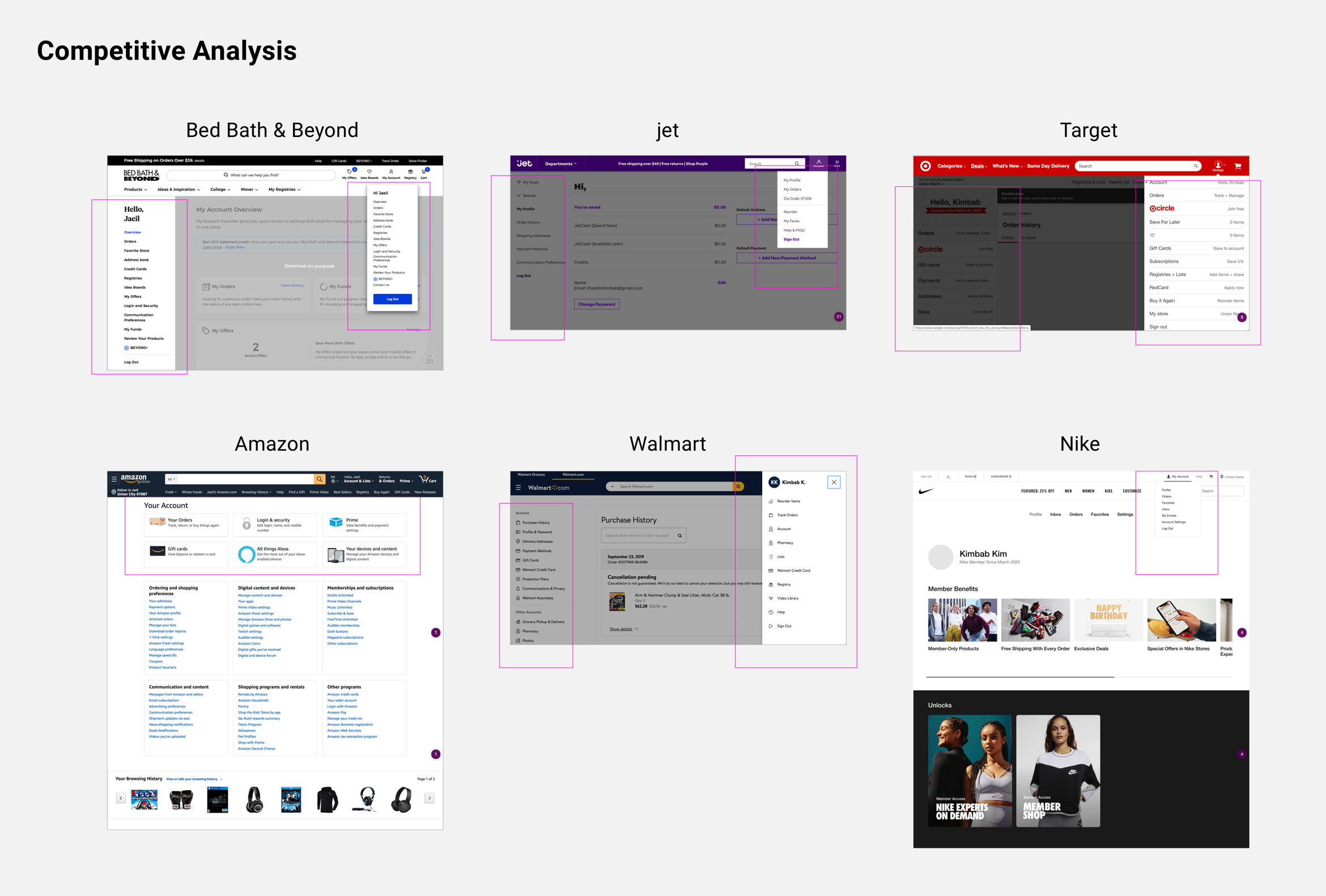
In order to better understand what’s in the market and industry best practices, I did an audit of other competitors and retailers to see how they handled their information hierarchy and design when it comes to their account navigation and flyout. Some key points included,
- A de-cluttered left-nav, by way of keeping only the essentials or dividing them into sections
- The fly-out was not simply a copy-paste of the menu items on the left-nav
- The fly-out can improve by boiling down to the essentials, and it also provides an opportunity for promotion
User Testing
AB Testing Round 1
Round 1 design (above)
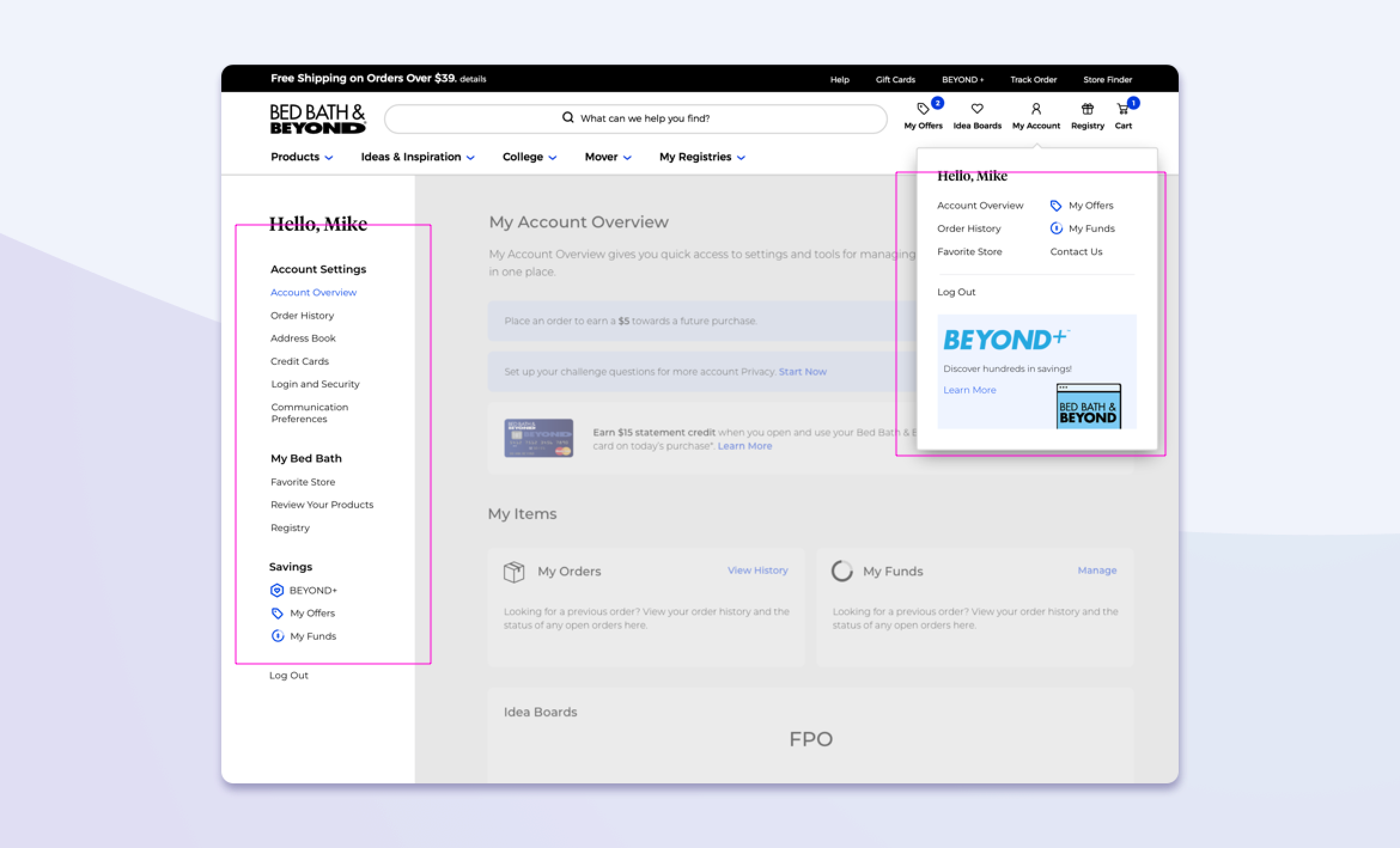
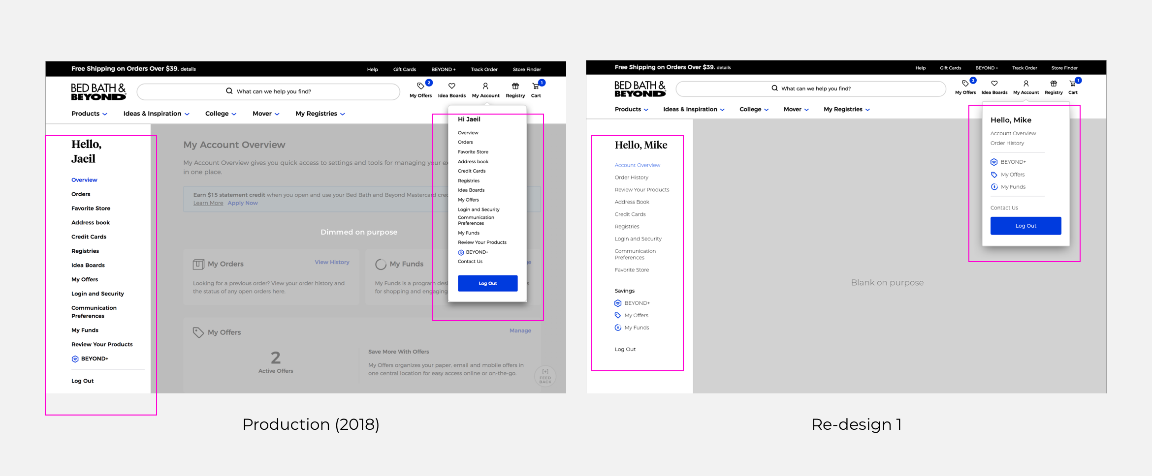
Using the design that was live at the time as the base against a new design, I conducted an AB user test. The new design saw data from click-mapping and user sessions from Quantum Metrics to inform our design decisions, and featured sectioned-out hierarchy for the left nav. The purpose was to better tie links that made sense thematically. For the flyout, we again used data from click-mapping and user assumptions to filter out frequently clicked links, but also tried to add in business objectives as “BEYOND+” (Bed Bath membership) and My Funds (Bed Bath stored value). Users felt that,
- Current organization seemed overwhelming (4/5 users)
- Re-design felt more concise and better organized into categories. However, opinion was mixed on items featured on the flyout
- Multiple users thought “Credit Cards” and “My Funds” meant the same thing, or didn’t understand what My Funds is entirely from the name. This led to conversations beyond the nav changes for discussions on problems of branding of the stored value program.
AB Testing Round 2
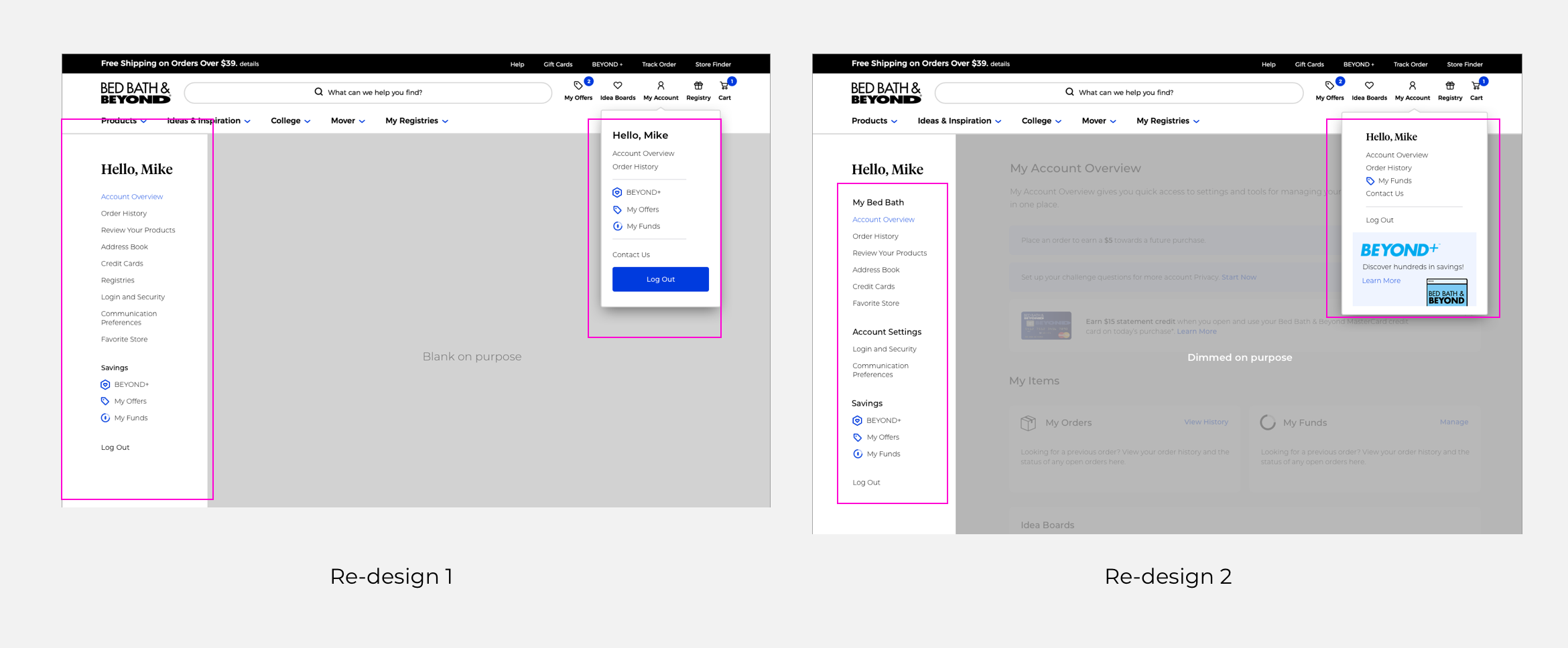
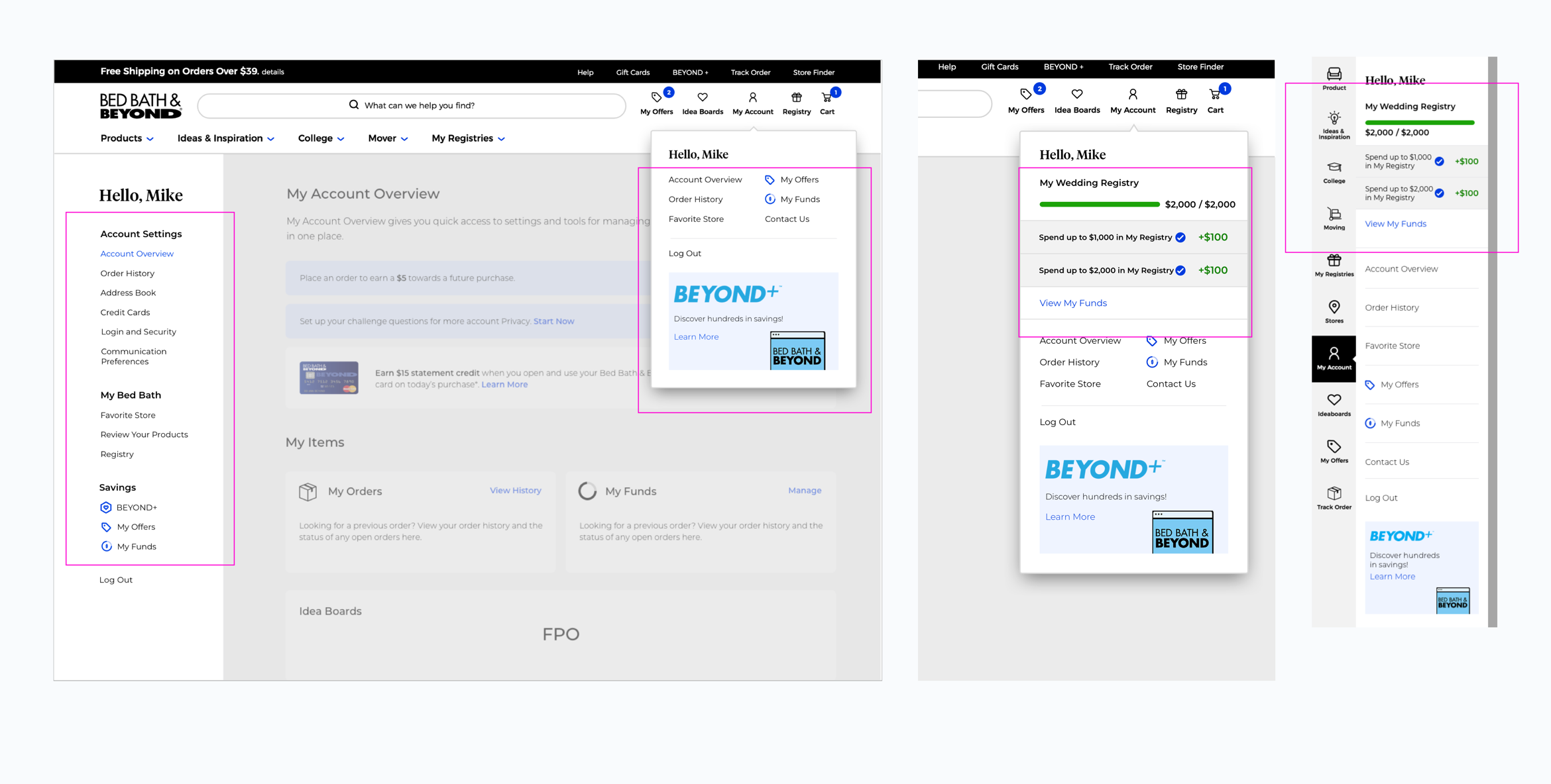
Round 2 design (above)
With insight from the first round of testing, I changed up some aspects and tested again. For example, moved Address Book, Credit Cards, and Favorite Store under a section called My Bed Bath to be more accesible to users. For the flyout, I gave less prominence to the “Log Out” button, kept My Funds due to the savings for customers as well as business incentives, and added wider width for better use of space.
- 4/5 users preferred the Re-design 2 because they felt the divisions were clearer
- Users were still confused about what My Funds were. However, they were more aware of BEYOND+ due to the extra copy and prominence as an ad
- One user noted that instead of My Funds, would like to see My Offers
Design Changes
After going through multiple feedback from users, as well as direction from the UX head, we launched the AB test with the newly proposed design next to what was in production. The results were positive. For example, there was a
- 77% lift to MY Funds (2,079 v.s 1,176)
- 4.1% more visits to the My Account Overview Page
The change cleaned up the nav while also pushing for traffic to key pages
This new design was also made to be flexible for future additions to the flyout. This can be seen with the addition of a new feature in a later Quarter; a feature that tracks promotions for users to earn Bed Bath Stored Value (SV) called “My Funds”, which is a different project that I worked on down the line.